The Omelette Bistro logo has a really fun, unique design. The yellow, scribbled aspect of the image fits perfectly with the food that is featured for the bistro. I like the use of handwritten font for the brand part of the name, coupled with the traditional font used for the description of the business. The handwritten font adds a homemade feel to the whole logo and thus, the brand, while the traditional font adds class and professionalism. It's quite simple, but unfortunately, the only drawback is that it is hard to replicate the image perfectly. Nonetheless, in essence, it possesses all of the qualities necessary for great logo design. This logo does not need to be overly versatile, as it caters to only one industry.
Website: www.whatwasthere.com


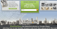
Whatwasthere.com is a nicely designed website that allows people to see what used to be at a particular location, using old photographs that have been uploaded to the site. The function is stated on the homepage, making it clear what one is supposed to do there. The only problem is that it shows up at the bottom, which does not jump out at users, but luckily, the font is large. There is no joining the site or becoming a member unless you want to upload your own photos, so it can be used immediately by anyone without any pressure for commitment. The color scheme is pleasant to look at and, for some reason, seems to fit the subject of the website perfectly; the website is a historical tool that has a fun edge to it. Once a city is selected, the navigation is very straightforward and is designed flawlessly. Finding what you're looking for is great because it's either there or it's not. There's no real digging involved. Because Whatwasthere uses the Googlemaps layout, users are already accustomed to how the site works, so it's a brilliant concept to fuse a new idea with familiar functionality.