Logo: Liverpool English Pub
Maybe it's the alcohol talking, but I have a thing for pubs and their logos. While it's not the most simple logo, the Liverpool English Pub is certainly stylish. It's so clearly a UK company, judging by the font they use and the shield. I really like the color scheme and the imagery. As pubs can get real trashy real quick, this makes the business seem classy and trendy in an unpretentious non-hipster way. This is one of those rare cases when I know if I saw another logo blatantly copying this, I wouldn't be able to tell, yet I really like it. So basically, it's not simple, it's not memorable and it's not versatile, but it has a certain something that I just like about it. It's not trying to be clever. It's just doing its thing and if you don't like it, too bad. And that's exactly how I like my pubs.
Website: Soundofmyvoicemovie.com
This website is basically a trailer for a movie (IN THEATERS APRIL 27TH!) called Sound Of My Voice. It really only has one function and that is to entice viewers to watch the movie. There are no play, pause, rewind, fastforward, or stop buttons. It simply plays and the viewer has to sit there and take it like a man. While I normally don't care much for this lack of control, it's totally in line with the fact that it's a movie trailer, like you're sitting in a theater. In this way, I feel like it's a very effective way to structure the website. I think we, as web users, are used to a website that gives you options and navigation and this and that, but I think it's kind of refreshing to see this. As consumers of media, we're looking more and more at computer screens and I like that this website has almost a retro pragmatism to it. Throughout the clip, little icons pop up that you can click on to learn a bit more about what the movie might be about. This is all the control you get, though. At the end of the clip, you finally get some choices. They are as follows: "Watch Again?" and Share. The movie itself seems to have a mysteriousness to it and giving users too much control takes away from the point of the site. This website, of course, has an expiry date to it, but that's what makes it so cool.
Friday, March 23, 2012
Wednesday, February 8, 2012
BDC963 Week 7 Journal
Logo: BMW
This logo is reliably classic. For the most part, it has not changed since the start of the company. It's very sporty, which is the kind of imagery the company should be projecting, with its tire-like shape and checkered flag patterning. Blue is used here to great effect, I find. Sure, blue means loyalty, but here it just adds a "speedy" feel to the logo. I don't know what the hell they were trying to do with the Motorsport Roundel years, but the actual logo hasn't changed much so it's certainly timeless. Like many companies trying to keep up with Web 2.0 and whatnot, the 2000 logo retains the original idea almost perfectly, but they added a little 3D shimmer. The only thing I wish they could have done with the image is give it a bit of edge. It has a very soft, roundness to it that I think that, when actually placed on the hood of a car, looks a little bit silly, like a toy. Past that, though, I couldn't really see it working for anything other than a vehicle company of some kind.
Website: www.stormingjuno.com
This is one of those rare times when something like a website has really affected me emotionally. Using interviews, music, and small clips from the show, the people who created the docu-drama Storming Juno have a website that is as engaging as I should hope the product itself is. I actually listened to the opening of the site, unlike a lot of other websites that have an intro. Of course, you can skip it if you want. The main page is a 360-degree affair that allows you to click on different categories of witnesses to D-day. You can just navigate the page by way of links on the left side of the screen, but it allows users to immerse themselves in the experience and click on different perspectives for themselves, based on the visual picture in which they are placed. If they only offered navigation by links, I probably wouldn't care to click on them. Once you click on a category (tanker, medic, etc...), you can click on a particular person's telling of the event. Very cool stuff.
BDC963 Week 6 Journal
Logo: M and M Meat Shops
I like the M&M Meat Shops logo because it kind of looks like it could only be food-related. The orange coloring, as we know, makes people hungry, while the blue provides a sense of loyalty or trust with the brand. The lettering makes it look like it is already an old-fashioned deli for some reason but the lettering below brings it into modern times, even though it is not flashy. It is sort of classically cool. The only problem I have with this is the name. Because of the "M & M-ness" of it, it requires the ampersand, which kind of makes me think of a lawyer's office, but thankfully, the bright colors remind me that this is a meat shop. It is somewhat odd to say, but the logo has a nice corporate vibe about it that makes it look extra professional and implies that the company cannot be anything but a franchise.
Website: Autotopsy.ca
This website is really cool in the same way that my first blog (the orchestra one) was.
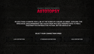
Autotopsy.ca is an offshoot promotional website for the Showcase TV show "Crash and Burn." What the site does is allow users to see different background stories concerning the people involved in a fictional car crash by using video and links. This function is stated on the homepage as pictured in image #1. Once you pick your connection speed (which I find really considerate and handy), you are taken immediately to the action. In the bottom right corner of the page there is always the option to find out more about the show and also, some navigation capabilities, but it is extremely subtle. This lack of pressure to learn more about the show invites users to explore the website and use it for what it is meant to do. Furthermore, the most important things to click on are obvious in their importance due to their placement on the page and, like all well designed multi-sensory websites, the sound is optional. This is very slickly produced and I cannot help but be sucked into the action. But that might just be because I like the whole "see it from everyone's perspective" thing.
Sunday, February 5, 2012
BDC963 Week 5 Journal
Logo: KISS
While it may seem overly simple and possibly too non-descript, I think this logo is a stroke of genius. If you're not familiar with it, it's the logo for the rock and roll quartet known as KISS. Being the over-the-top glam rock gods that they are, the logo featuring chunky, all-capital, sans-serif font with its signature jagged S's, sums up the band perfectly. Purists will tell you that the rhinestone version of the logo found on the first album is the original, but this is irrelevant. As long as it has all-capital letters and has the stylistic S's, it is the KISS logo. The image shown here is probably the most well-known version. In other words, it is HIGHLY adaptable, taking on many forms as one Google image search will demonstrate. Each time a new album came out, the logo had changed color but it always remained the same shape. Because it is so easy to replicate, it is a merchandiser's dream and nightmare. I do believe, however, that it is an encapsulation for all the hallmarks of great traditional logo design.
Website: privatestockdenim.com/welcome/
This website is for a fashion line that will be available in Canada, hopefully soon. My aunt is the CFO for the company and she sent me the link to see what I thought of it, so I thought, "hmm what a strangely perfect sense of timing she must have" as she never e-mails me out of the blue. It's new, so while there are some issues like dead links here and there, I think the site is built quite well so far. The homepage hits viewers immediately with a bright, white layout and a high quality closeup shot of the model who, if I was a girl or gay, I'd probably linger on for a while. The shot avoids weirdness by shifting through the different aspects of the site, along with their respective "front pages." As discussed in class and as is the case with all the websites I have written about, functionality is key in website design. So while the site is stylish and image-oriented, there is a bar at the top left that provides users with a go-to area for all their navigation needs. While the auto-scroll function (cursor moves left, page moves left, cursor moves right, page moves right) is nothing new, its inclusion still adds a cool factor to the site. Also, some auto-scrolls are too sensitive and move too fast with drastic pulls in direction. Jon Koon's is well-paced, albeit a bit stiff, but I would rather deal with functional stiffness than oversensitivity. I find that the content is all relevant. Sometimes, fashion companies try too hard to add value to their brand by having pointless blogs and links to other cool sites, but the blog section here actually adds value to the site as it gives an insight to the designer's lifestyle and point of view when it comes to the creative direction of his line. Probably a 4 out of 5 star website. 1 star deducted for broken links and small things like the stiffness of the autoscroll.
Sunday, January 29, 2012
BDC963 Week 4 Journal
Logo: Omelette Bistro
The Omelette Bistro logo has a really fun, unique design. The yellow, scribbled aspect of the image fits perfectly with the food that is featured for the bistro. I like the use of handwritten font for the brand part of the name, coupled with the traditional font used for the description of the business. The handwritten font adds a homemade feel to the whole logo and thus, the brand, while the traditional font adds class and professionalism. It's quite simple, but unfortunately, the only drawback is that it is hard to replicate the image perfectly. Nonetheless, in essence, it possesses all of the qualities necessary for great logo design. This logo does not need to be overly versatile, as it caters to only one industry.
Website: www.whatwasthere.com
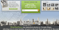
Whatwasthere.com is a nicely designed website that allows people to see what used to be at a particular location, using old photographs that have been uploaded to the site. The function is stated on the homepage, making it clear what one is supposed to do there. The only problem is that it shows up at the bottom, which does not jump out at users, but luckily, the font is large. There is no joining the site or becoming a member unless you want to upload your own photos, so it can be used immediately by anyone without any pressure for commitment. The color scheme is pleasant to look at and, for some reason, seems to fit the subject of the website perfectly; the website is a historical tool that has a fun edge to it. Once a city is selected, the navigation is very straightforward and is designed flawlessly. Finding what you're looking for is great because it's either there or it's not. There's no real digging involved. Because Whatwasthere uses the Googlemaps layout, users are already accustomed to how the site works, so it's a brilliant concept to fuse a new idea with familiar functionality.
Subscribe to:
Posts (Atom)